Rogers.com
Product Design
A website is an ever-changing entity. It's constantly evolving through redesign, updates, A/B testing and optimization. Over the course of fifteen months, I worked with product owners, Digital Redesign and Marketing teams, developers and internal stakeholders to migrate multiple Rogers.com pages to Contentful content management platform, while making sure that the business unit objectives and accessibility guidelines were met.
As a hybrid designer for Rogers Connected Home, I wore multiple hats. Switching between UX, UI and Product design, I determined the page flow, hierarchy of elements and component selection to create the right digital experience, sometimes designing net-new components and icons to be incorporated into Rogers Design System. I also decided on the look of the pages I created. In addition, I performed extensive image studies, compositing and retouching for most web-based projects, eventually defining and documenting image selection standards for Connected Home team.


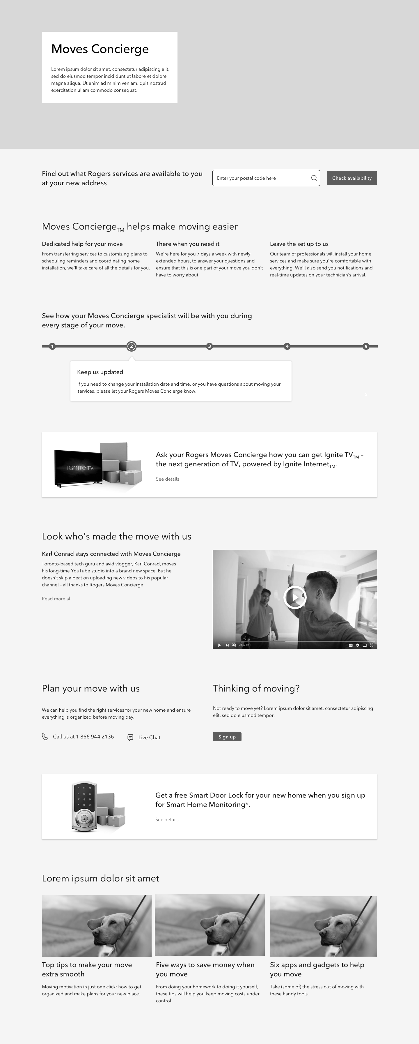
Moves Concierge page redesign
Moves Concierge is a free service available to all Rogers customers. It takes care of transferring Connected Home products (TV, home phone and Ignite Internet), customizing plans and coordinating installation at a new address. Research showed that most Rogers users weren't taking advantage of Moves Concierge because they weren't aware of it. The dedicated page was buried in the Support section. The layout was dated, the copy was confusing, and most information was arranged in a custom-built vertical timeline component that wasn't accessibility-compliant or mobile-friendly.
My goals were:
• to make sure that the page clearly communicates what the service does and its benefits
• to bring the visual design in line with newly developed Rogers Design System
• to make the page accessible and responsive
• to introduce merchandising spots for promotions and special offers
• to add a lead generation component
• to bring the visual design in line with newly developed Rogers Design System
• to make the page accessible and responsive
• to introduce merchandising spots for promotions and special offers
• to add a lead generation component
Early mid-fidelity wireframes


During the mid-fidelity wireframe stage, the business requirements changed and the stakeholders decided that the page would become a part of the Contentful CMS migration. The layout had to utilize only existing Contentful-ready components, all custom elements had to be removed and replaced. I determined which components would serve best and worked with Contentful team lead to have the functionality of some of them expanded, so they could better serve the needs of the UXD team. I also worked with the Content Designer to simplify and clarify the copy. Following approval from the Business Unit, I saw the project through development and QA stages to launch, and subsequent A/B testing phase.
High-fidelity mockups
Self-Install page redesign
The redesign of Connected Home Self-install page, also a part of Support Section, became especially pressing in the first quarter of 2020, when in-person technician visits became impossible due to lockdown. Originally designed solely for modem and TV box self-installation, the page had to include the entire Smart Home inventory of forty-two products, and be versatile enough to accommodate more, as Rogers Connected Home line of products grew. The old pop-up layout had to be replaced.
My goals were:
• to design a page that could accommodate all Connected Home products
• to bring the page in line with new grid and design system
• to make the page Contentful CMS-ready, ensuring easy addition of new products by POs
• to make the page accessible and responsive
• to use existing components without changes, as the timeline didn't allow for any alterations
• to bring the page in line with new grid and design system
• to make the page Contentful CMS-ready, ensuring easy addition of new products by POs
• to make the page accessible and responsive
• to use existing components without changes, as the timeline didn't allow for any alterations
Original Self-Install page
High-fidelity mockups
I knew that we would need a filtering system to get the users to the right Smart Home product quickly, but first I had to decide how the products would be grouped. After performing a card sort, I realized that the existing filter component wasn't robust enough to accommodate the existing number of product categories and reached out to developers on three teams to find a solution. The more complex filter was in development it wasn't going to be ready in time. After some back and forth, it turned out that the product information was searchable, which lead to a simple and elegant solution - a smart search field at the top of the page.
The smart search allowed the user to view the products by type or by serial number, instantly reducing the forty-plus cards to a more manageable number. The cards were organized by popularity. I added the Load More and Back To Top buttons, as well as a count indicator at the bottom, in case the users wanted to browse the section instead.
