Investment Growth Calculator
Product Design
With Investment Growth Calculator the team wanted to design an experience that painted a clear and simple picture of the benefits of regular investing. The goal was to highlight how compound interest could help the users grow their money over time and communicate the benefits of investing early, even if a little.
We had two target user profiles: the mass affluent clients, who had some knowledge of investing but weren't making regular contributions, and less financially established clients, who could be looking to begin investing but didn't know where or how to start.
To design a successful tool that met our users' needs, we concentrated on iteration and testing. We used split testing, guerrilla testing, unmoderated and moderated surveys, and moderated as well as unmoderated remote testing. Our users were between 18 and 66 years of age, had interest in investing and were familiar with online banking.
While designing, we concentrated on simplicity, visualization and engagement to build a tool that was intuitive, easy to use and accessible, with the minimum number of input fields necessary. The side-by-side positioning of the graph and the form fields allowed instant visualization of results based on input, encouraging the users to play with the numbers to see potential investment outcomes.
To increase engagement and to better meet our users' accessibility needs, we added an option to view a custom-generated animated video with voiceover and subtitles. It allowed the users to choose how they want to get their results and delivered the message through multiple avenues of communication.
Low- and mid-fidelity wireframes
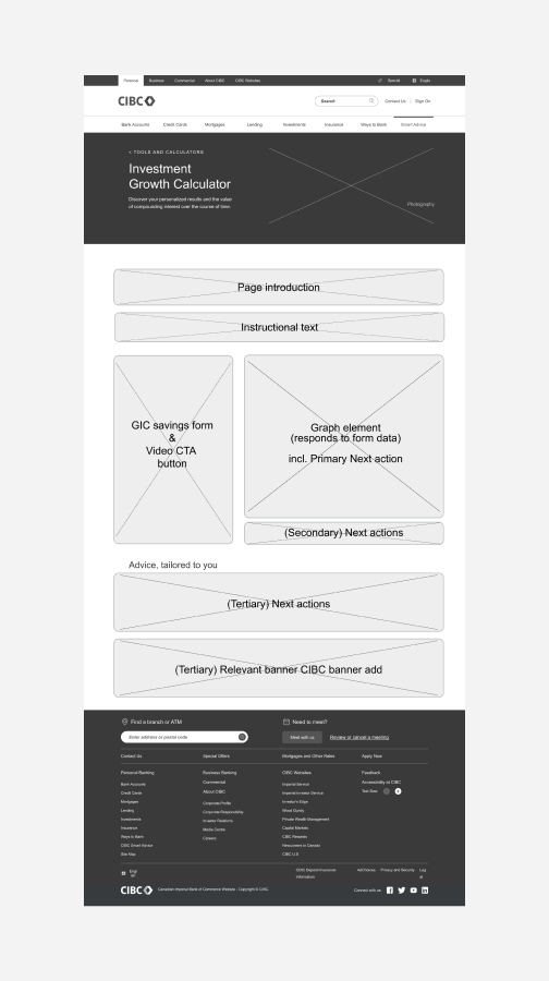
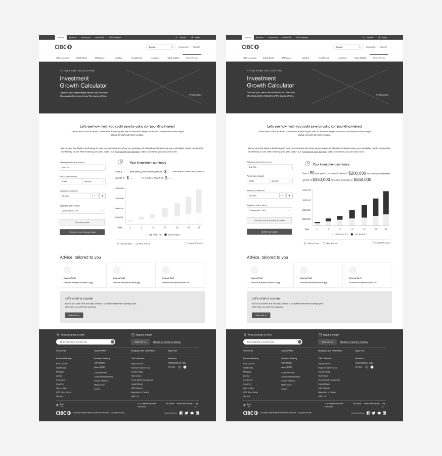
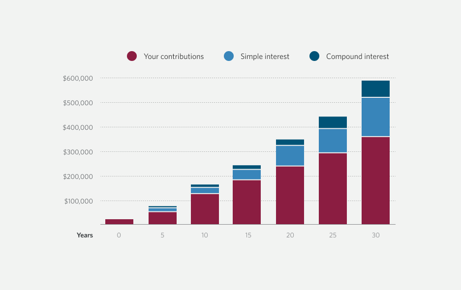
The graph was the hero of the layout. I engaged a developer and went over options available to us through our data visualization tool, to determine which types of graphs would best suit our needs. Having narrowed it down to two, we conducted a split test with 270 users to see which one performed best. It was a near-even split, with the bar graph winning by half a percent. However, when follow-up interviews were conducted, many users changed their minds and the bar graph won by a landslide. White divider lines were intentionally added as an accessibility feature for increased readability.
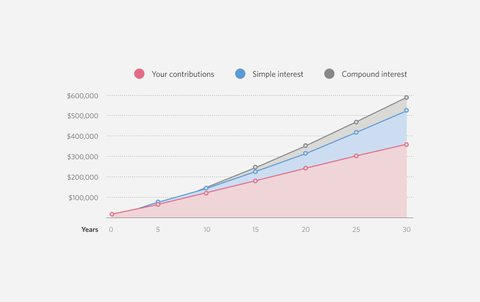
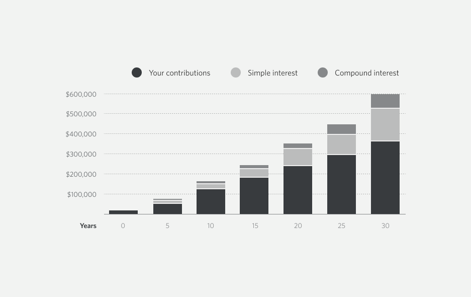
CIBC visual guidelines state that each graph has to start with one of two branded red colours. Keeping that in mind, I did a colour study using the CIBC swatch matrix and created fifteen AA-accessible colour options for our graph. Through guerrilla testing, I narrowed it down to two. During remote testing in layout, the users overwhelmingly preferred the darker red because it differentiated the graph from other red elements on screen.

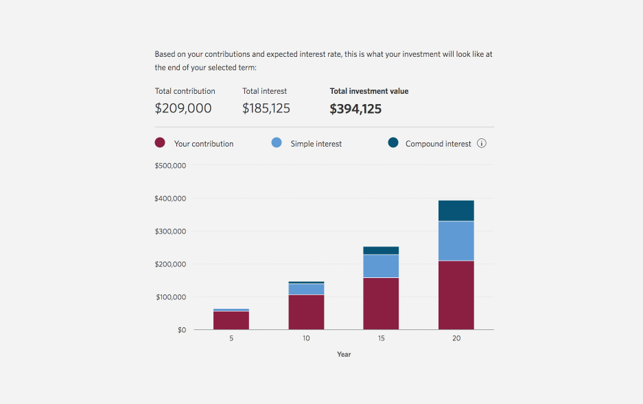
Another essential element of our data visualization was the summary. Its purpose was to present user results in an easily-digestible way, emphasizing projected growth. The team was split between the dashboard-style, numbers-forward approach that was easily scannable but impersonal, and the conversational, copy-driven approach that carried a risk that users who don't like reading might skip it and miss important information.
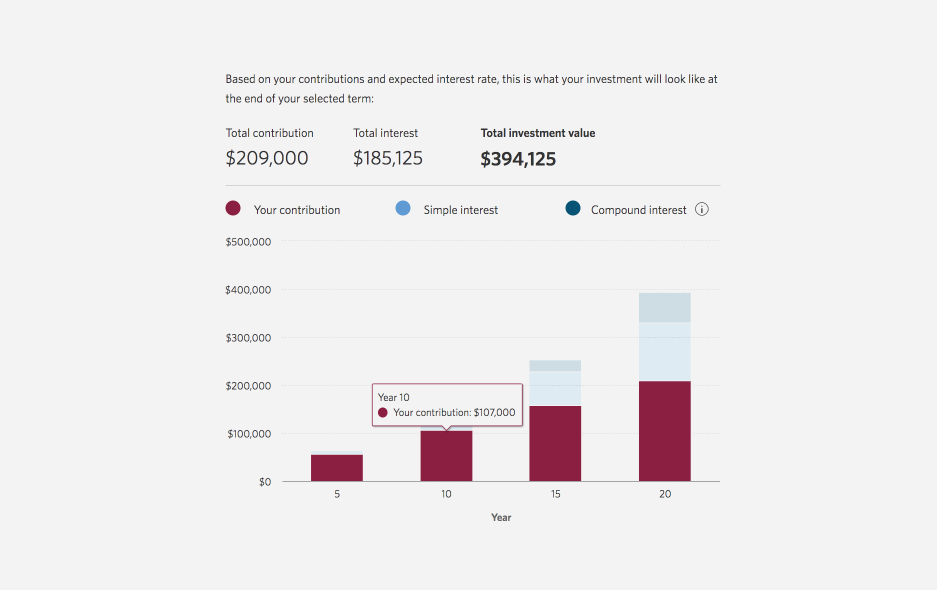
Through multiple iterations, I arrived at a middle ground solution by asking what were the most important numbers our users wanted to see right away. I proposed that they were the total contribution, the total interest amount and the final investment value. In testing, the users confirmed this. We leveraged the interactive feature of the graph to provide more information and let the users see the principle/interest/compound interest breakdown for every segment of the graph.
"I feel like [it's] all the data I would need, just a complete overview, it's comforting to me to be able to see all that..." – A user
Every element of the layout was tested, including the graphic banners. Out of four shortlisted options illustrating growth and investments, users overwhelmingly preferred the coin graph illustration because it most closely connected to the idea of incremental investment and growing wealth.




Over 700 users participated in testing of the Investment Growth Calculator. We tested everything, from headlines to the number of tooltips to pre-filled input amounts. Our work paid off. Over 80% of users rated the new investment growth tool as Excellent, and over half said they would be comfortable moving forward with their investment journey after using it. Users appreciated that there were opportunities for further research independently, and 65% said that speaking with an advisor about setting up an investment strategy would be their next step.
If you'd like to check out the CIBC Investment Growth Calculator, click the button below.
